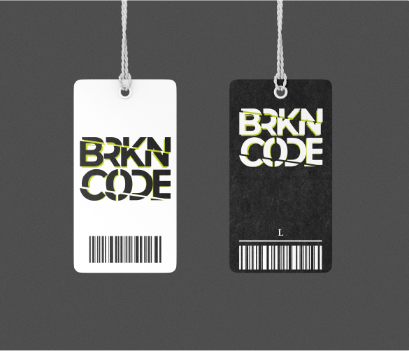
Full-scope GTM brand design for Brighton-based apparel brand
Project details
Brand Design
Packaging
Digital assets
BRKN CODE is a groundbreaking queer, androgynous clothing line designed to challenge and break traditional gender norms. The brand’s mission is to offer stylish, gender non-conforming apparel that provides a space for those outside the binary to truly express themselves. BRKN CODE focuses on androgynous styles, creating products that cater to diverse body types and sizes, particularly supporting the trans+ community.
As a startup with no existing branding, BRKN CODE needed a complete brand identity from the ground up. The challenge was to create a bold, inclusive visual identity that reflected the brand’s mission to break the binary and provide a sense of belonging and empowerment to its audience. This required a design that was modern, edgy, and deeply resonant with the brand’s core values and target market.
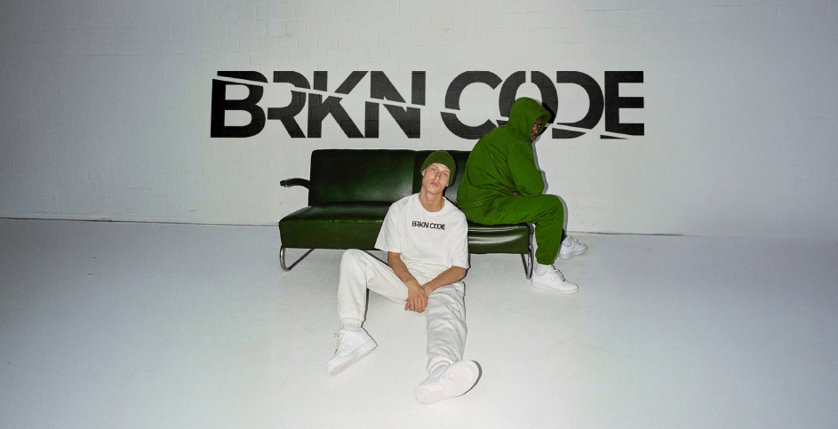
Design process
How we designed
the brand
Creativity & Innovation
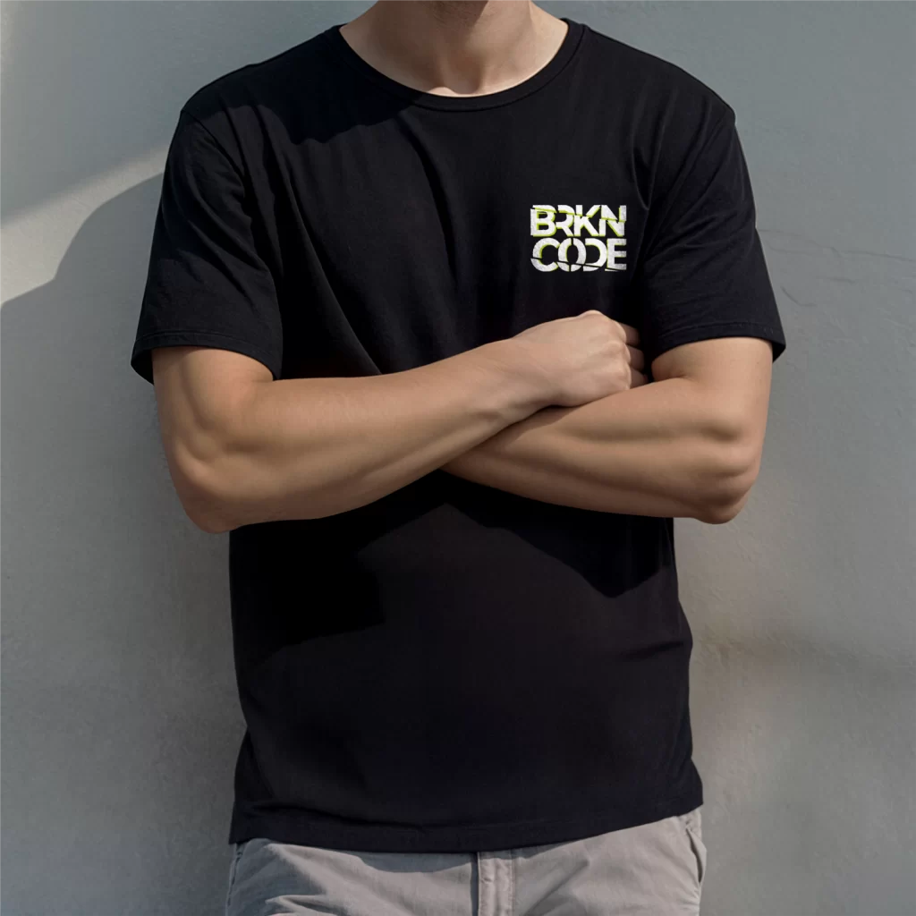
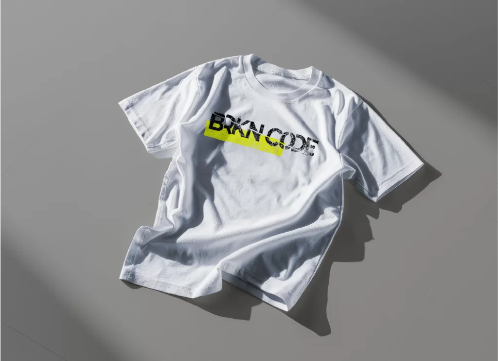
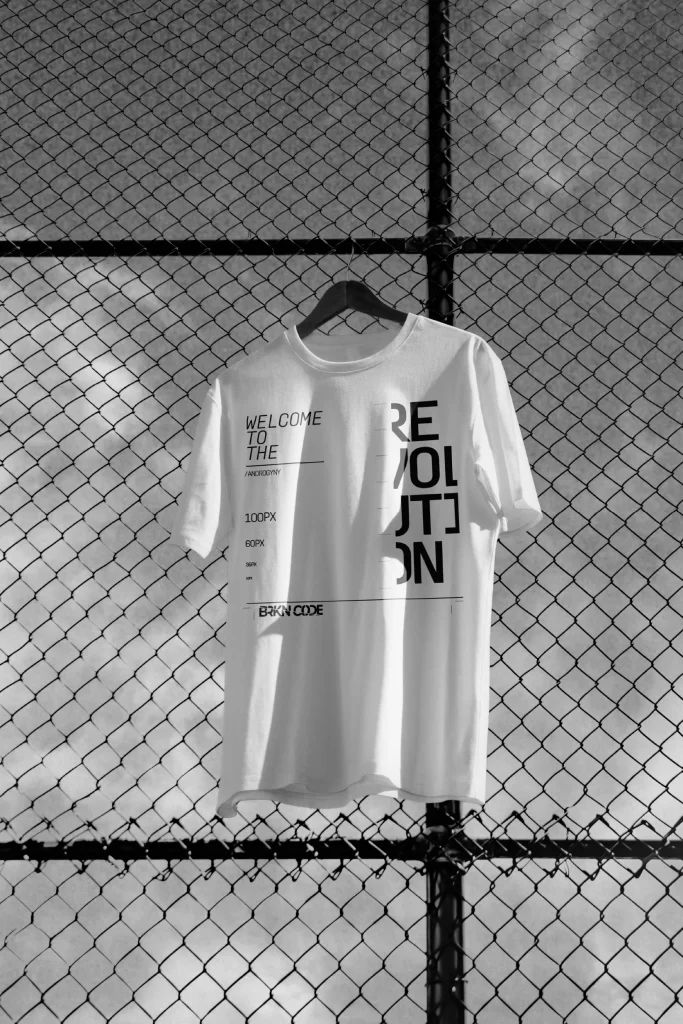
We set out to break convention, crafting a brand identity that challenged traditional gender norms. The fractured logo and bold aesthetic embody disruption and self-expression.
Data-driven
Through research and community insights, we identified the importance of inclusivity and sustainability. These principles shaped choices in typography, colour, and brand application.

Brand-first approach
Every decision was rooted in BRKN CODE’s mission, to support the trans+ community and provide a genderless space in fashion. The brand’s values guided design at every stage.
collaboration
The process was deeply collaborative, with constant feedback and alignment. Together with the client, we ensured the final identity captured authenticity and lasting impact.
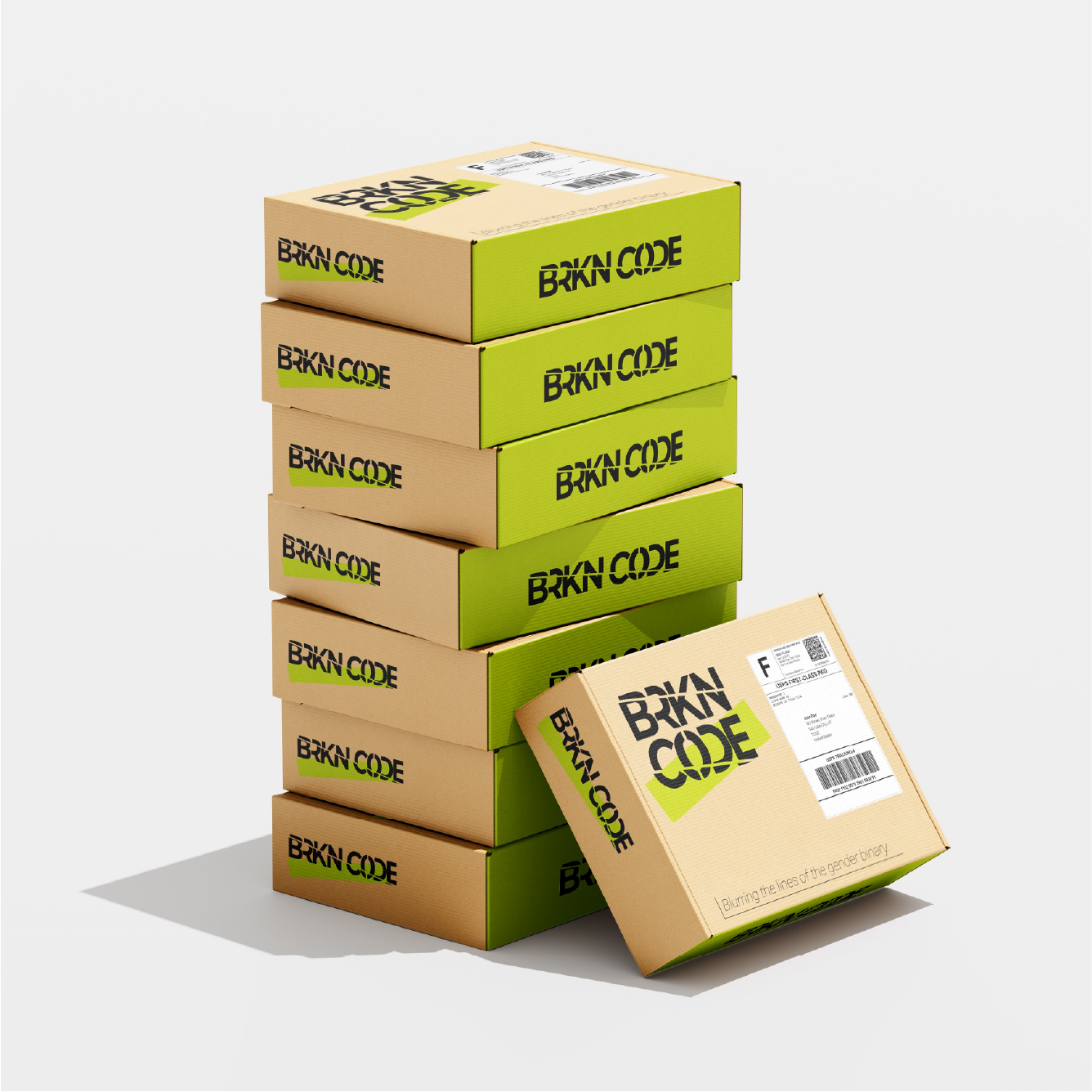
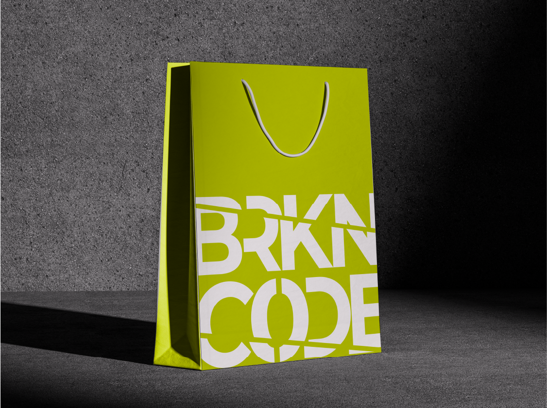
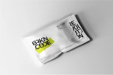
The packaging for BRKN CODE was designed as a natural extension of the brand. Bold typography, fractured motifs, and a vibrant colour palette created boxes, bags, and wraps that were instantly recognisable. Beyond protecting the product, the packaging reinforces the brand’s identity and delivers a memorable unboxing experience for customers.
colour decisions
Giving the brand life
The BRKN CODE colour palette was built to reflect strength, inclusivity, and bold expression. Deep Black and Phantom Ship ground the identity in confidence, while Cheerly Kiwi adds an energetic edge. Pure White balances the set, ensuring clarity and contrast across every application.
Deep Black
Phantom Ship
cheerly kiwi
pure white
What TEC thought
Don’t just take our word for it
Drop us a line
Are you looking to recreate BRKN CODE's success, or just want to chat about how Jed Creative can help your business grow? We’re here to make your ideas a reality. Fill out the form below or drop us an email!
