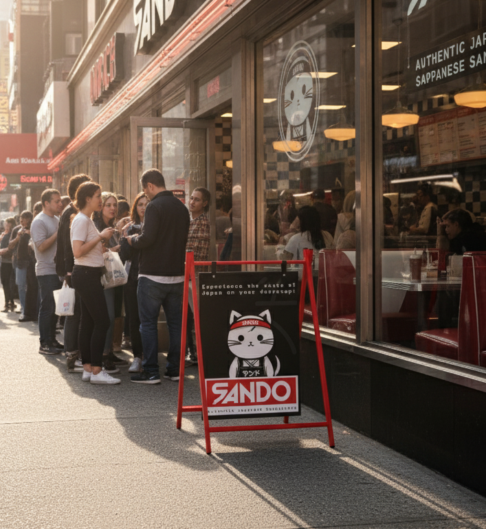
Complete brand design for modern Japanese inspired sandwich shop
Project details
Brand Design
Physical assets
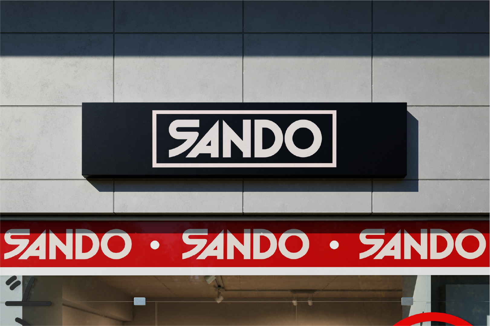
Storefront Signage
Sando is a Japanese-American sandwich shop founded by a family passionate about combining the rich flavors of Japan with the classic American sandwich. Their mission is to craft sandwiches that not only deliver incredible taste but also offer a unique cultural experience. Sando’s warm and approachable personality is reflected in everything from their food to their branding, aiming to bring people together through a shared love of good food and tradition.
They needed a brand identity that would stand out in the food industry while staying true to its roots. The goal was to blend the authentic flavours of Japan with the casual, approachable feel of an American sandwich shop. This identity had to appeal to a broad audience, from curious teens to seasoned foodies, all while creating a strong and memorable presence.
Design process
How we designed
the brand
Cultural Fusion
We set out to blend Japanese minimalism with bold American diner energy. The identity had to honour tradition while feeling fresh, modern, and approachable.
Bold & Simple
A strong red, black, and off-white palette reinforces confidence and appetite appeal. Paired with clean typography, it creates an identity that is both striking and versatile.

Distinctive Character
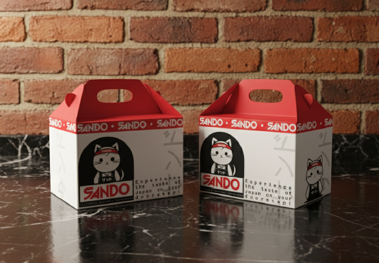
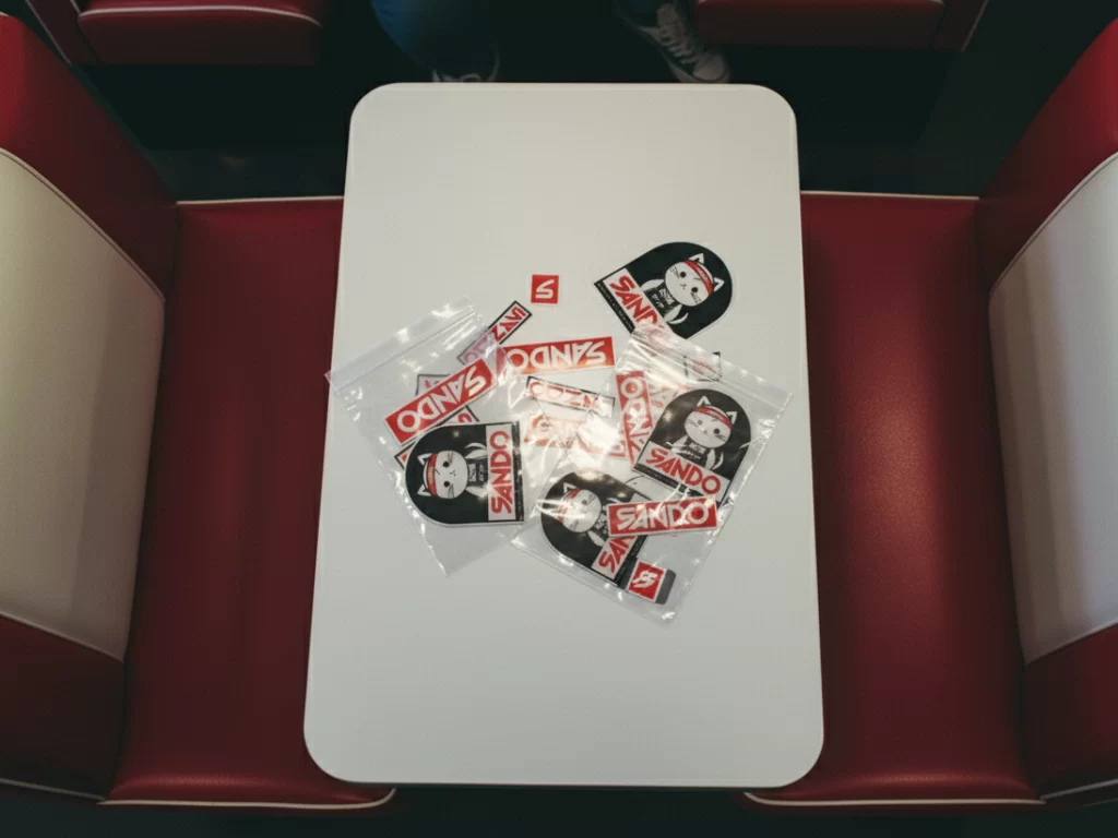
The Sando mascot became a playful brand ambassador, designed to add warmth and memorability. It connects instantly with customers across packaging, signage, and digital platforms.
Consistency in Action
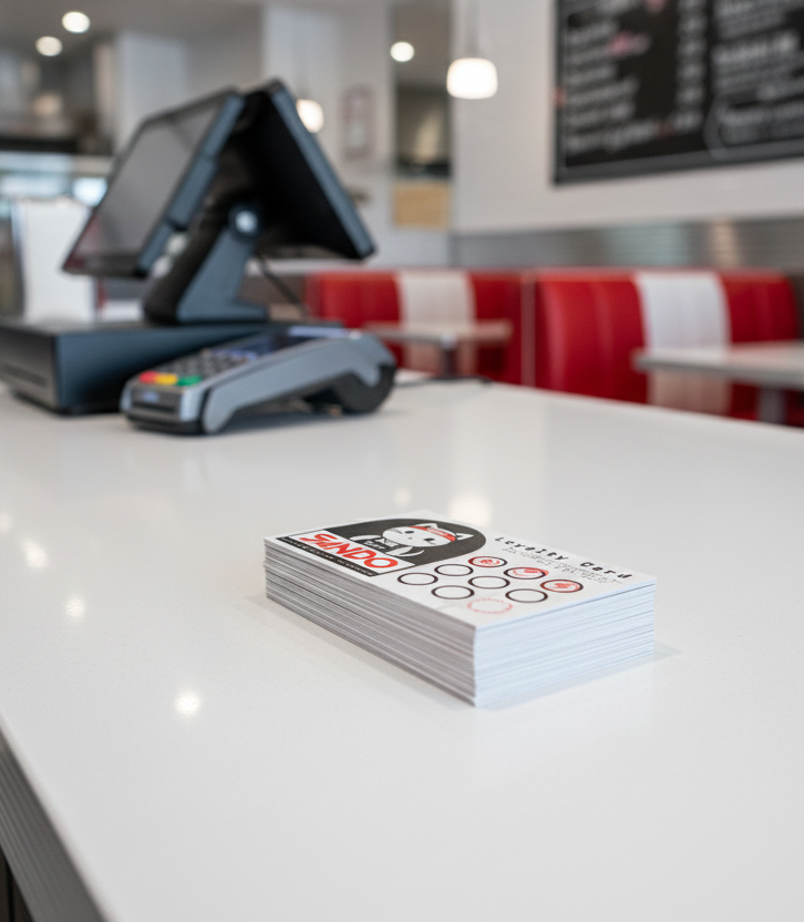
From storefronts to loyalty cards, every touchpoint was designed to carry the same voice. This ensured Sando’s brand feels cohesive wherever customers encounter it.
colour decisions
Giving the brand life
Sando’s colour palette was designed to balance boldness with simplicity. Cherry Red provides appetite appeal and instant impact, while Black and Off-White add contrast and clarity. Together, the palette creates a modern, versatile identity that works seamlessly across digital and physical touchpoints.
Black
Cherry red
Off-white
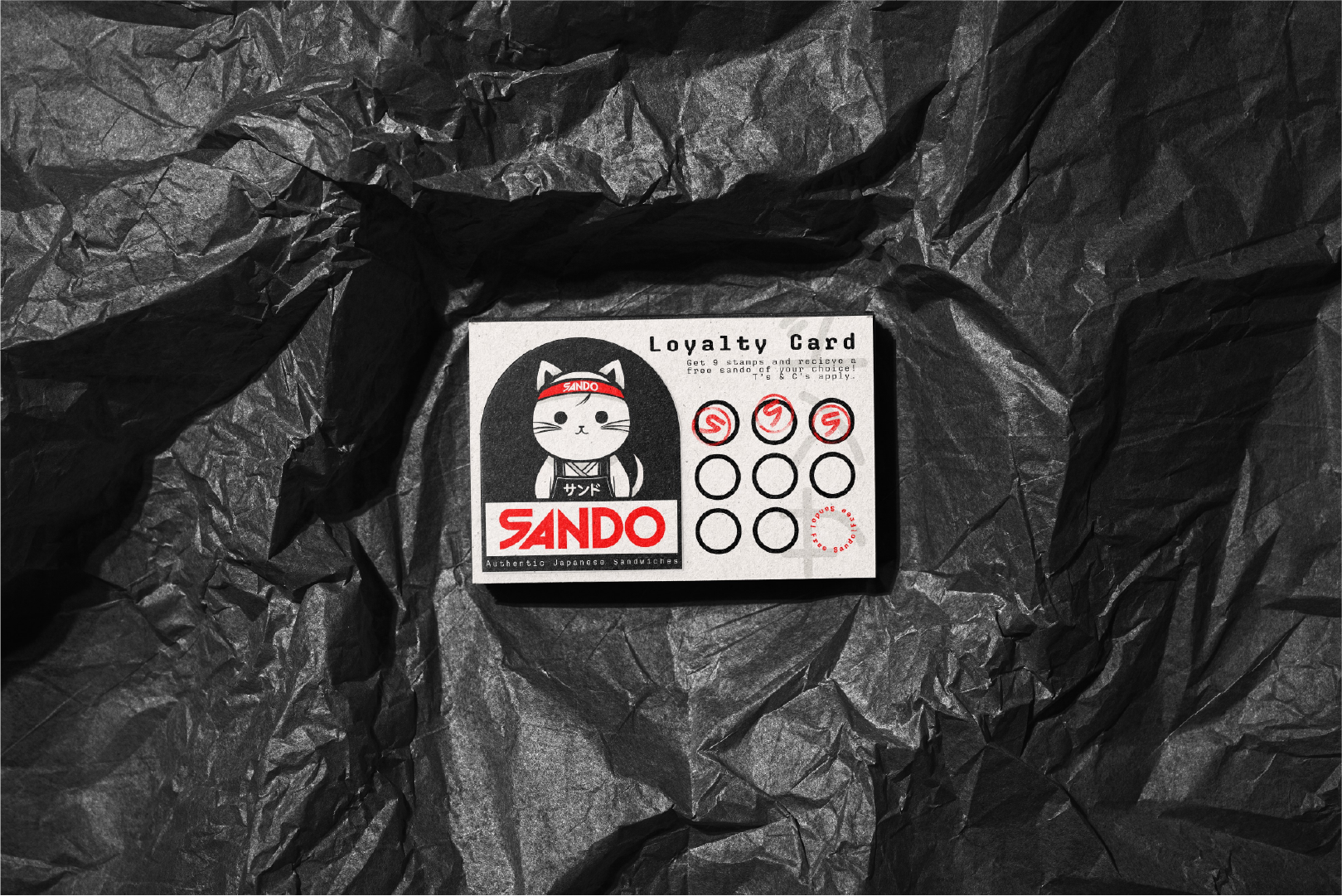
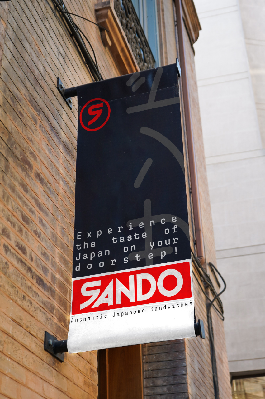
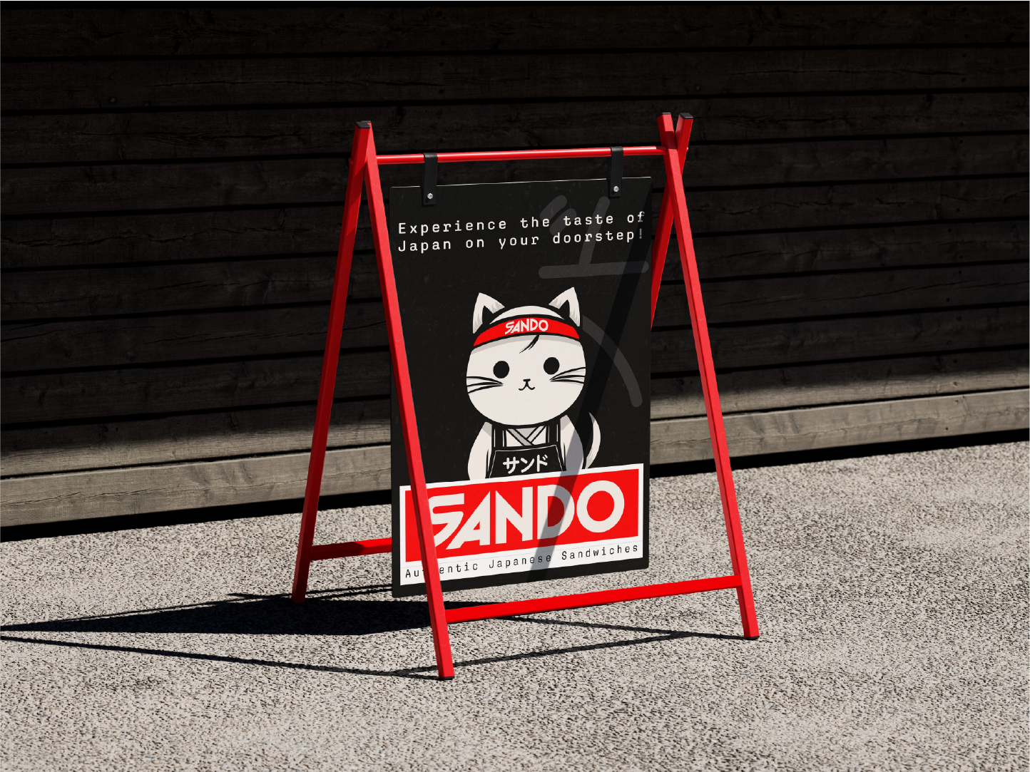
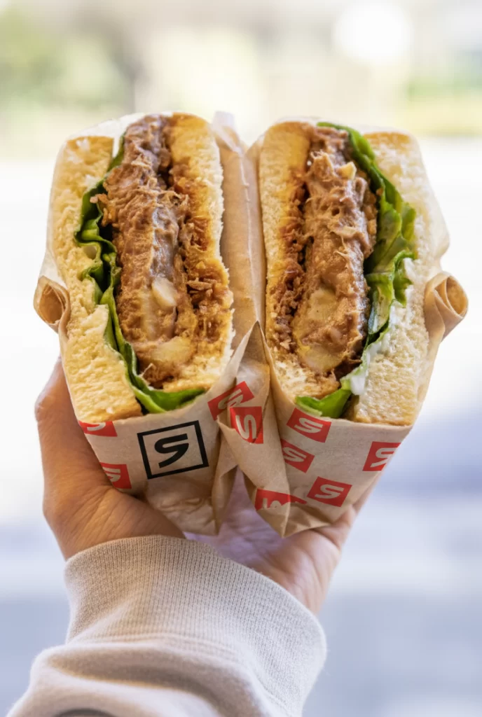
Sando’s identity was extended across every touchpoint, from loyalty cards and packaging to signage and in-store displays. Bold colours and playful illustrations create instant recognition, while consistent typography and design ensure the brand feels cohesive wherever customers interact with it.
Drop us a line
Are you looking to recreate Sando's success, or just want to chat about how Jed Creative can help your business grow? We’re here to make your ideas a reality. Fill out the form below or drop us an email!

